Designer Pierre Hardy explains his inspiration for the packaging of Hermès Beauty.
By Éric Troncy
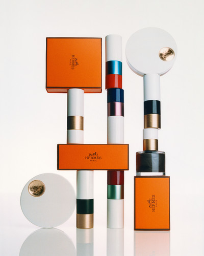
Photograph by Charles Negre
Designer Pierre Hardy explains his inspiration for the packaging of Hermès Beauty.
In the Hermès offices on Rue de Penthièvre in Paris’s chic eighth arrondissement, in a large, recently renovated building, Pierre Hardy and I are seated in a room that resembles a 1980s vision of a hyper-clean future. It is all a bit William Gibson-esque. Everything is white, slightly clinical, and through vast bay windows you can see the tall grass of the landscaped terrace and behind, the Eiffel Tower. On the few, immaculately white shelves sit regularly spaced perfume bottles organized according to colour, as well as small cylinders with white lacquered tops and coloured bases, all illuminated by a line of harsh, white LEDs.
Hardy is sitting at a big table, the colour of candied chestnut, his hands folded neatly together on the tabletop, exuding both serenity and excitement. The French designer has been working with Hermès since 1990, and was recently put in charge of designing the packaging for the house’s new beauty line, which launched with lipsticks in 2021.
The system he invented for the containers is composed of some 15 elements, with lacquered, brushed, and polished white metal tubes covered halfway by two bands of colour.
These little tubes are beautifully eye-catching. Refillable and made in metal, they have been designed with the environment in mind. In a playful twist, each tube is closed with a magnet that produces a satisfying and rather magical ‘click’. Their appearance even has something of the striped poles on a showjumping fence, a nod, perhaps, to Hermès’ origins as a harness and saddle maker.
Éric Troncy: What was your thinking behind the design?
Pierre Hardy: Cosmetics are subjective, corporeal and carnal, and I wanted the shapes of the objects to be the opposite of that, so there could be no confusion between what they are and what we do with them. I didn’t want it to be… how would you say it these days?
Ergonomic?
Pierre Hardy: Worse than that – organic! I wanted a certain abstraction, a distance. This line will be built up over time, over a very long period of time. These are small, simple volumes that can be added to and combined with others. For me, it was a question of looking for elementary forms, without any real narrative.
‘Beauty seems like a word that we’re scared of today… almost an impossible concept.’
Did you adhere to the Bauhaus notion that you can change lives if a fork is better designed?
Pierre Hardy: I may have been thinking more about the Memphis Group in general, and Ettore Sottsass in particular. The colours in Sottsass’ work strike me as very different, but yes, it’s true that the yellow and ‘Burgundy brown’ do evoke one of his astonishing Columns. My ambition was to make the ‘most generic of generics’ – the generic lipstick. The only concession to sensuality is the little hollow on the top of the tube, which has a golden Hermès Ex-Libris motif on it, like a fingerprint.
I’ve never really thought of Pierre Hardy as a box or tube designer! Even though you were really involved in the design of your stores, and you create fresco drawings for some of them.
Pierre Hardy: It’s a pretext! I’ve always wondered what I would do if I were an artist, but I don’t know. I have no idea what I would make if I wasn’t working in the applied arts. It’s very different to creating a work of art. Deep down, I think I like responding to an order!
‘I wanted an absolute, because I think that Hermès the brand is all about the absolute: absolute quality, absolute perfectionism.’
That’s something you have in common with Warhol. He said that what he really fantasized about was having a boss to tell him what to do.
Pierre Hardy: When a request is made, I project myself into it. It’s different to the images I produce for myself. In this particular case of the lipsticks, I wanted an absolute, because I think that Hermès the brand is all about the absolute: absolute quality, absolute perfectionism. Beauty is the newest department at Hermès; it only started two years ago. There were 15 métiers including leather goods and equestrian, men’s and women’s silk and ready-to-wear, shoes, jewellery and watchmaking, furniture and tableware – and now we have beauty. With that and with cosmetics, there’s a quest for the ideal. A woman who wears make-up always thinks that she will look more beautiful, if not the most beautiful, and I wanted these objects to be a kind of ideal to achieving that. Maybe because I work in other domains that are the opposite – which are anecdotal, ephemeral – this felt like an opportunity for me to be part of something with a very different relationship to time. I always try to look inside the object itself to reveal the physical qualities or formalism it may contain, and then to bring that to the fore, to elevate it, to enhance it, sometimes just to clean it up. Cosmetic literally means ‘to put in order’ – it’s putting in order what you have. I didn’t want there to be anything superfluous with the body, lips or skin, while trying to remain consistent with Hermès, in this case, the house’s gestalt aspect. Beauty seems like a word that we’re scared of today. In the 19th century, there may have been one idea of beauty, but today that’s no longer true. There are ‘beauties’, perhaps, because even certain sorts of ugliness are showcased as beauty now. ‘Beauty’ has become an almost impossible concept, especially in an age when making choices is seen as inappropriate, so that everything ends up being amazing.
Taken from System beauty No. 1 – purchase the full issue here.