Bali Barret takes us inside the Hermès colour kitchen.
By Thomas Lenthal
Photographs by Antoine Seiter
Bali Barret takes us inside the Hermès colour kitchen.
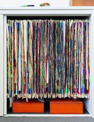
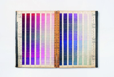
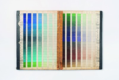
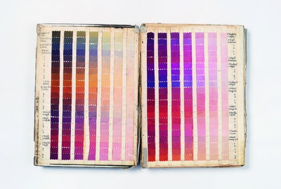
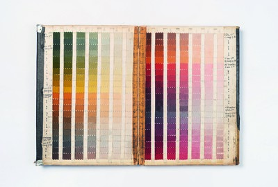
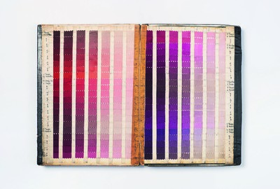
Hermès launched its first carré [silk scarf] in 1937, following a century of making leather harnesses and bridles for European nobility. Featuring a group of woman playing a board game around a table, the Jeu des Omnibus et Dames Blanches scarf marked the beginning of a new adventure for Hermès: colour. This was a proposition that would require its own factory, established near Lyon the same year, and a product offering that would become as emblematic of Hermès as its iconic orange boxes. Besides the iconic orange of the boxes, Hermès’ approach to colour is far from straightforward. Over 75,000 colours are held in their records, each of which came into being through a process as complex as it is kaleidoscopic; relying as much on the subjective interpretations of the human eye as they do on the science of colour theory – indeed, you’d be hard pressed to find a Pantone colour card in this most Borgesian of archives.
Eighty years on, Hermès carrés now account for 15 percent of the company’s €945 million revenue. Such is the house’s consummate use of colour, it is estimated that one of their silk scarves are sold somewhere in the world every 25 seconds. Overseeing this product division which releases four collections of 30 designs every season – and reissue classics such as the Brides de Gala in multiple colourways – is Bali Barret, the house’s wonderfully titled Artistic Director of the Women’s Universe at Hermès (Barret had previously been a design assistant at several Parisian fashion houses before launching her own label in 1999). Inviting System into her office and studio, high above Hermès legendary flagship store on Paris’ rue du Faubourg Saint-Honoré, she discusses the complexities and contradictions of an industrial process determined by intuition, why certain colours are popular in certain countries, and how we are now entering a cycle of non-colour.
Thomas Lenthal: As the Artistic Director of the Women’s Universe at Hermès, you are responsible for the carrés – the iconic silk scarves – which are celebrated not only for their inimitable designs but also for their arresting use of colour. Please could you explain the process – how do these colours come into being?
Bali Berret: Seventy-five thousand colours have been created since we started printing Hermès scarves in 1937. 75,000! With every season and every new colour, the spectrum broadens. It’s almost some- thing verging on infinity, it’s crazy. The colourists will look to find whether the colours in the scales we propose to them already exist, but it’s rare that a colour is ever exactly the same – we’re obviously working with subtlety here, in nuances of millimetres. If we need a slightly redder red, we’ll make it. We work on the creation of new colours and colour scales around a year and half before a collection comes out, to the rhythm of two collections per year. In the beginning, the process of colour creation is very intuitive; I give myself a few days to do nothing but research images and colour ambiances. It’s a process that’s anything but cerebral. I look through all of my book archives, I visit other book- shops, and I just go for walks. I look at so many things without even really knowing why – I guess I’m searching for an emotional reaction.
And these references could be photographs, paintings or fabrics, right?
Exactly. Even architecture – anything visual. I question everything that has caught my attention. For the silks, we have to work with a very wide spectrum of colours because we produce 12 different colour ways per design, and there are around 30 artworks.
So that’s 360 colourways per season?
Yes. Sometimes there are up to forty printing frames on a scarf, 40 shades of colour, so you really do need an enormous wealth of colours. Given that the spectrum is so vast — there are always blues, greens, yellows and reds – the question is, which specific ones? Even- tually it becomes a question of how to put the colours together. What harmonies am I drawn to? I attempt to understand why a certain combination interests or pleases me. Afterwards, I start to group things together by family.
‘75,000 colours have been created since we started printing Hermès scarves in 1937. With every season the spectrum broadens; it’s verging on infinity.’
What do you mean by ‘families’?
Chromatic families. I put things together, stop, take a look at them, think again and reassemble them. This happens several times. There are things that remain monochrome and others that are very multi-coloured, and progressively the options are reduced and I start to analyse what I’ve created. Is it modern, flat, synthetic, handcrafted? Is it bright, faded, greyish, nightish… what’s it all about? It’s not just about the colours, but the mood; the atmosphere. It’s a work I share with my right-hand man within the house’s silk métier [artisanal department]. Generally, we do four or five colour cards. Sometimes they will take us nowhere but we’ll still allow our- selves the opportunity to explore things – nothing is forbidden. Then, we’ll make a fairly strict decision based on the spirit and how the colours are going to be used, and pass it onto the attention and expertise of the colourists.
At this point is it a colour scale or a mood-board?
It’s much more precise than a mood- board. It’s like a chest of drawers containing manuals for each of the colours or images that explain why I like a certain image, composition, or inter- action of colours. At this point, we’ve started to establish a colour scale; we’ve selected images for each story and given names to every harmony.
How does your work with colour influence the rest of the house?
There’s no obligation for anyone to take from our work, but if someone asks for our colours, we share them, voilà!
So there is no real formal presentation of colours that you share with all the departments, right?
No. Each internal métier has its own voice, even if we do happen to share our inspirations. Creation at Hermès is about freedom.
So how do they find out?
I invite them to view our work. We ask the silk colourists, who are based in Lyon, to come up to Paris and share the drawings and colours for the season. I should also probably talk about the ‘Comité de Couleur’; it’s a very serious affair here.
Yes, what’s that?
At the time of Jean-Louis Dumas, a committee for colour was created which worked under his supervision in collaboration with the Lyon colourist team. For many years, Jean-Louis was the artistic director of the carrés and he oversaw the draughtsmen, artists and colourists in Lyon. To work on the colours, he established a commit- tee which included Leïla Menchari, the house’s ‘high priestess of colour’, and Tan Giudicelli, a former ready-to-wear designer at Hermès in the 1980s. When Pierre-Alexis Dumas took over from his father to become Artistic Director of Hermès, he handed Leïla the baton and she still presides over this ‘Comité de Couleur’. Leïla has an extraordinary eye and a huge knowledge of colour, and she was initially quite patronising towards me, saying things like; ‘Who is this young whippersnapper trying to tell me about colour?’ I eventually got her blessing, and we get on well together, even though my way of working with colour isn’t the same as hers — everyone has their own methods. These days, she still has an open invitation for our Tuesday morning colour meetings, and occasionally comes by; she still has that impressive ‘perspective’, it’s in her blood. When she’s here we’ll smoke a cigarette, drink some coffee and look at the carrés together. Pierre-Alexis also comes by all the time: I share the colour scale with him every season, and he follows up with his own expertise. Just like his father and grandfather before him, Pierre-Alexis has a particular affection and great eye for scarves and colours. He is what I’d call a colour addict too.
So there is still an informal commit- tee of sorts, with no absolute guardian over the chromatic field. You’d almost expect there to be – many houses have house colour scales which are not infi- nitely adaptable.
It’s an in-house joke to say ‘Hermès Red’, because we don’t even agree on what the Hermès Red is! It’s amusing, but it’s also quite revealing. Everyone here has their own personal vision of what that red would be. Even the Hermès orange box undoubtedly has 12 different oranges – it’s always much more defined on paper than on silk. There are really no limits here. In the whole process there’s a crazy level of precision.
What do you think made you the ideal candidate for this position?
No idea. I’d never thought about it. The idea of entrusting me with the carrés was a strange one as I never used print in my own fashion collections apart from Liberty prints and stripes. The only thing I can say is that I’ve always had this obsession with colour and harmony, and I would show my collections chromatically. I would have all my fabrics dyed too. When Pierre-Alexis Dumas first proposed the role to me, I thought it was a great idea and was filled with desire. He was very smart to see something in me that I hadn’t even realised was there myself. At that time, if I’d been asked to do anything else at Hermès – shoes, belts, clothes – I don’t think it would have come to me as nat- urally. Before I started working here, I really liked the classical, chromatic scale at Hermès, but I wanted to resolve the gaping divide between the extreme modernism and extreme classicism of the house – to find a chromatic realism, which became my vision. Coming from fashion design, I was conscious and concerned with how a season needed to tell a cohesive story. I leant towards the use of colour as a tool for structure and storytelling. I also watched how the colourists worked in very intuitive ways. I think one of the principal reasons for the success over the past ten years is the creation of a vocabulary of colour that is both systematic and visceral. Colour is a fatal weapon. It’s all about visual reaction and emotion – it is something that can be perfectly ordinary or completely extraordinary. An Hermès carré is a signature which evolves. What makes it so special is the combination between colours, design and silk.
Do you use Pantones?
No. It’s either swatches of paper, silk, thread or leather.
‘It’s an in-house joke to mention ‘Hermès Red,’ because we can’t even agree on what the definitive Hermès Red should actually be.’
You mentioned before that there were 30 new designs created each season.
Yes, although it’s actually more like 40 as we also have several re-editions per season. Altogether it’s around 800 new references per year, if you include the different range of colours.
How do you select the designs?
We choose the designs almost two years before we develop the colour scales, as the engraving process takes such a long time. The designs often have a link with the theme of the year.
These designs are selected from the drawings produced by the Hermès draughtsmen, illustrators, or artists. How many draughtsmen do you currently work with?
About 50 working regularly with us.
And how many drawings does each draughtsman propose?
Some propose only one, others can pro- pose five to 10, but it’s not only propositions from their side. It is all about a long creative process achieved through constant dialogue with the draughtsmen about their designs; the drawing, composition and storytelling are developed together. This process — which can take anywhere between a month and a year — takes place in a kind of spaceship we call ‘Studio Dessin’, which is the heart of creation for silk design. Of course, we only buy the drawings we like! We reject a lot as well.
Do the draughtsmen give you all their drawings in colour?
Yes, but they are not involved in any of the next steps; they entrust us with their drawings. Colour is unassociable from the design. Colour is the enlightener of the drawing; the passage from paper to silk is the real birth of a design.
So, they will have worked on a colour scale that might have nothing to do with what you end up using?
Yes. In truth part of my job is about circumventing the occasional absence of colour comprehension.
Meaning that there are good draughtsmen who are no good at colour?
Yes. I actually try to be completely oblivious to the colours of the drawings we receive. I used to find it hard to engage with a drawing without colour. Now, 15 years later, I can detach myself from colours.
‘Colour is a fatal weapon. It’s all about visual reaction and emotion - it is something that be perfectly ordinary or completely extraordinary.’
Wouldn’t it be easier for you if the draughtsmen just worked in grey scale?
There are some designers who have actually become carré draughtsmen – they have a sublime hand and have never worked in colour. I would buy their drawings in black and white, and then add in the colour. Most of the time we want the draughtsmen to colour them in though – some of them do a beautiful job. Ironically, sometimes when a draughtsmen is a good colourist, their drawing can almost be a bit ugly when first placed onto silk. It’s really disappointing. However, once you rework the colours, it can be explosive! Sometimes I need to see something ugly to understand that it can become something beautiful. It’s weird but true.
I understand. It allows you to have an objective viewpoint.
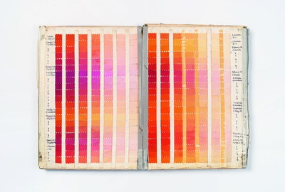
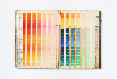
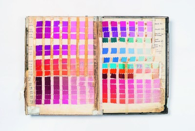
I was pretty minimalist before joining Hermès. But I’ve since become the queen of multicolour: working on other people’s compositions really opened up my colour spectrum. I like appropriating something that isn’t mine to begin with and getting my head around the logic of it. That’s what I find really fun and exciting. To have real talent for colour, you need to have a photographic eye, to be able to foresee how something on paper will look once printed. Our colourists don’t use computers: they do things manually, photographically, with abstract visual formulas. That is how our colourists still work, even the youngest ones. Of course, now we have tools that allow us to check those abstract visions on computers.
Is everything prototyped? Are there not tests with watercolours on paper?
No, we don’t use watercolours. We evaluate all colour combinations directly on silk. The colourists work with their colour scales to create formulas for every colour. Then, if they need complimentary colours, they’ll get them from the colour charts in the archive. Our Tuesday morning meetings allow us to work on the colour combinations on each scarf and fine-tune the printing. It can be very challenging from a technical point of view. It’s very subtle work. It would be strange to record those work sessions, because even though we understand each other 100 percent, to an outsider it would seem a crazy, abstract dialogue with lots of unknown words. It’s a true connoisseur’s conversation. I love that work, even though it’s actually rather exhausting and can last up to four or five hours. It’s a rejuvenating bath of colour every week!
What kind of light do you work in?
I try and work mainly with daylight, but in winter it’s hard so we have to use electric lights which I hate. In fact, when you asked about the stability of my opinion, what can really influence me is light. Under electric lights, there are reflections which affect your colour vision – I hate it and it makes me lose confidence in my perspective.
The paradox is that in a shop when you chose your carré it’s under a very yellow spotlight. And it is all very subjective work – do you feel your subjectivity becomes stabilised with time so that something which bothered you on Tuesday would still bother you the following Friday? Or, would you say that your subjectivity or feeling toward something might change direction, even after you’ve spent hours on reaching a conclusion?
Because I do so many things, I may for- get that I had said something a week before and repeat it – it’s great when that happens and usually I’ve got a pretty stable vision. But other times, like today, for example, I saw a drawing called À La Plume that’s by a young draughtswoman called Florence Manlik. The mock-up is amazing, but it’s turning out to be unbelievably complicated to colour. It took a long time to find the right combination of colours. At first, I thought the colourist hadn’t been able to create a colour scheme that corresponded to the original spirit of the drawing. Later, I realised I was the one who’d become too attached to the original spirit of the drawing, it’s colouring and principles – I’m very Cartesian about my loyalty to a draughtsperson – and that in fact the colourist had been able to liberate something. I’m still going around in circles about it though! My real fear is falling asleep on the job. The actual colouring process is enchanting and after a while you start finding everything beautiful. At Hermès, you mustn’t ever forget that you have to surprise, to do the opposite of what is expected as a form of freedom.
‘I was pretty minimalist before joining Hermès. But since I’ve become the queen of multicolour: other people opened up my colour spectrum.’
So you have to be constantly questioning your vision…
The difference between now and when I first started is that back then, I never really asked myself, ‘Do I really like it?’ Now I ask myself this question all the time. If there is even a shadow of a doubt, we’ll drop it.
You can get drunk on colour…
…and on the satisfaction gleaned from a beautiful object. I don’t want to fall into that. It’s not enough for it to be beautiful; it has to have something extra which makes you want to grab it and run away. That’s the feeling that I want to provoke.
An instant, powerful desire.
Yes, it can’t just be beautiful – it has to be intense, it has to be extreme. My biggest challenge right now though, is figuring out how to do colour and non-colour at the same time.
Can you elaborate?
There are cycles in colour. Right now, we’re actually coming out of a very colourful cycle – where the brighter a print, the more applause it got – to a place where there is a desire for less colour.
How long has this cycle lasted?
About ten years. There are moments of greater or lesser desire for colour in general – at least in terms of the use of colour. Right now I want to use colour a bit differently. I’ve realised I’m wearing less colourful scarves these days and looking for something with a little more sobriety. But we are talking about Hermès scarves, and as we have to produce colour, how do we resolve this question? It’s something I’m working on…
Ok. So, how many colourists do you have working for you?
Ten.
Are they trained exclusively in-house at Hermès or have they been trained at schools prior to arriving?
They are dedicated to the house. Some of them have been to art school or studied graphic design. Others learnt about colour in-house in the factories, much like artisans; the old-school way.
‘To have a real talent for colour, you need to have a photographic eye; to be able to foresee how something on paper will look once printed on silk.’
Where are they based?
The work is divided between two sites in the Lyon area. Every week, two or three colourists come up to Paris. We also go down to Lyon two or three times a season to work there.
Just a little technical question: what is the first thing they do when they receive your colour schemes? Do they try to locate the colours, or do they reconstitute them?
They create formulas for the colours of the season.
Does it take a long time to find the specific colour?
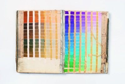
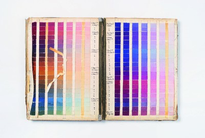
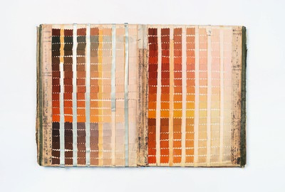
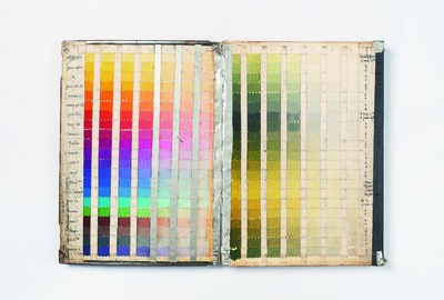
Yes, but the colour charts are organised by families of colour. The colour- ists also have internal libraries and reference points.
So they’ll find it in the files and also in their minds!
Yes, in what we refer to as the ‘colour kitchen’ – they literally cook up the colours in big pots using the colour formulas – it’s complete alchemy.
Is this system richer than Pantones?
I hate Pantones; our work is about hues.
Tell about the history of the carrés and colour composition at Hermès.
The very first scarf — the Jeu des Omnibus et Dames Blanches — was created by Robert Dumas in 1937. Dumas was fascinated by the self-imposed rigor of printing on silk.
How many combinations were there of that first scarf? Do we know?
Very few. There have been nine colours.
When did it become so exponential?
After the war, in the 1950s, was when it became a real and continuous production. Robert Dumas adored drawing and had a friend with a printing factory whom he asked to print his scarves. If he liked a drawing, then he would have it made into a scarf and put it in the shop. When he saw that they were successful, he just started doing more. It was very empirical. Although designing was his real passion, he could not realistically do everything, so he called on talented specialists, among them Hugo Grygkar, who went on to sketch the famous Brides de Gala in 1957. He also commissioned Cassandre for the designs known as Perspective and Littérature.
Would you ever re-edit a 1937 model in its original chromatic scale?
Yes. We re-edited Jeu des Omnibus et Dames Blanches in 2007 for our 70th anniversary in a 70cm x 70cm format.
How do you select the re-editions?
I refer to our archives to see what exists in terms of colour. If something catches my eye, then we select it for a re-edit and recreate it. Sometimes if we’re struggling with a colour, well look at the archives. I re-read the archives every season and observe, I look at all of our Brides de Gala. It’s very instinctive.
How many colourways exist for Brides de Gala?
Forty to 50.
Is the Brides de Gala something that you re-edit every season?
No, not at all.
It comes out when it comes out?
There are no rules or restrictions in our choices. Having these archives is a treasure. We’ve brought out the Brides de Gala for this summer in a giant pink and green version – it’s sublime. But before that I’ve also played with the Brides de Gala in many other ways: it has been dip-dyed, embroidered, indigo printed, used on bigger or smaller formats also, for bandanas…
How many other iconic designs like Brides de Gala exist at Hermès?
There are many other super powerful designs. You can see how there is enormous potential here for colour creation. Yet, the art of colour lies in how you use it. Where the Hermès scarf stands out is with the quality and depth of its colours and compositions. They are unique.
Do countries buy scarves in very spe- cific colours? Could you predict what colours a certain market would take?
Yes. I like to know who bought what. Colour sensitivity is deeply cultural. Generally speaking, bright colours are the most popular. However, the Japanese like to buy paler colours because it looks pretty with their skin tone. Americans prefer classic combinations, with lots of orange, gold and black. Everyone adores a scarf with lots of blues; those are big classics. The crazy thing about Hermès is this almost megalomaniacal use of all those colours, it’s absurd!
The most is 40 colours for one scarf?
48 or 49, I think. We beat a record.
What was it for?
For a scarf called Waconi by Antoine Tzapoff – it has a portrait of a Native American woman with all the nuances of her skin and the landscape on it.
After so many years at Hermès, how do you avoid repeating yourself?
I keep files on every season. There are things that I don’t use one season that I may save for the next. Usually, I don’t like what I’ve put aside. I need novelty.
Often in fashion, you find that over the years a designer will establish a rather restricted palette. Even for Yves Saint Laurent, it remained a box of paints.
Clothes and scarves are very different. As a designer, I did have a restricted palette, which was vital. Here we’re working with an abundance of colours. There’s nothing like it.
Even though there is an infinite spectrum, there has also been a sensitivity to certain colours over the last ten to 12 years.
It’s inevitable that some colours are habitual, which is both good and bad. I’m constantly searching for new techniques or combinations. I never want to be blasé about what I create, and that’s hard. I think what inspires me most are all the great colour obsessives, the great artists like Josef Albers – I can look at his colour scales forever.
Albers’ approach was less emotional, almost scientific… yet it certainly provokes emotions.
I find Albers’ work very emotional: he worked on the principle that colour interactions create emotion, almost like a doctor who gives out a prescription.