For fine jeweller Victoire de Castellane, life is a box of Caran d’Ache.
By Eric Troncy
Portrait by Juergen Teller
Photographs by Antoine Seiter
For fine jeweller Victoire de Castellane, life is a box of Caran d’Ache.
“I think there is a naïve and widespread misunderstanding about theories of colour. Take the colour circle, or rather the function of the colour circle: it is a purely theoretical concept existing in the mind but not in our actual experience. Nobody can ever paint it out ‘correctly’ because the moment one tries to visualise what has been proved by optical experiment you get involved with pigment – and all the scientific purity is lost. I could teach the so-called principles of my work to anyone in, say, half an hour, but I doubt if it would be of much use. Because once you get involved with colour reality you are immediately faced with an immense range of variables which govern your vision. These cannot be isolated intellectually without distorting the facts of sight.”
Bridget Riley
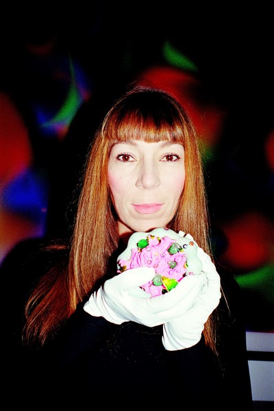
When she revealed this secret in 1978, the British painter Bridget Riley already knew that uninterrupted exploration of colour and its illusions formed the heart of the oeuvre she’d started more than ten years previously. Like her – and others before her – the fine jeweler Victoire de Castellane has no intention of renouncing the frenetic exploration of colour: its deceptions and declensions, its wisdom and scandalous potential. Instead of painting, de Castellane, who is Creative Director of Christian Dior fine jewellery, and has exhibited her objets d’art at Gagosian galleries in London and New York, prefers another medium – a combination of precious stones and lacquer – and she’s substituted scientific pigment references for the folklore of gem names: kunzite, opal, Paraiba tourmaline, spessartine garnet, andradite and spinel. It’s a lexicon whose very utterance whets the appetite of an imagination deeply anchored in childhood memories, faraway impressions and happy accidents.
For those who’ve developed great expertise in any discipline, theory is nothing but an element among others in the exercising of this discipline. You must know how to trust yourself and oppose a world that seeks to rationalise a state of mind that’s necessarily less so. Ultimately this is how it becomes less a question on the theory of colour and Pantone charts, and more about animation and memories of mint and grenadine, of a perfumier and a florist. Without these collective experiences, theory isn’t worth much and technique lacks that disposition for storytelling, without which, the truth be told, boredom would triumph. Even the most abstract paintings must have a story to tell in order to be unique.
Eric Troncy: Could you start by sharing a colourful childhood memory with me?
Victoire de Castellane: The giant box of Caran D’Ache, with 96 colours…
Easy but acceptable. 96 colours is a lot!
Victoire: It certainly is!
But oddly I can visualise them too, all those colouring pencils.
Victoire: That metal box with a photo of the mountains on the lid – probably a Swiss landscape.
And most of all, the wonderful gradation: the pencils organised by colour, from the lightest to the darkest, from red through to blue…
The gradation! The infinity of possibilities promised by that gradation, the blue, the turquoise, and of course that gesture; pushing on the end of the pencil in the box to lift it and make sure you don’t damage the tip.
Did you grow up in Paris, Victoire?
Victoire: Yes, in Paris. On the Avenue d’Eylau, at Trocadéro, at my grandmother’s apartment. I must have been six or seven years old. It was there – I remember it very precisely – that I discovered those Caran d’Ache colouring pencils. I said to myself, ‘It’s magic, the people who made these must be very kind people.’ Then I’d always wonder, ‘How could you reproduce that photograph with these pencils?’
But not only did you find these boxes wonderful, you also knew what you wanted to do with them.
Oh yes! It wasn’t the object itself, but what could be done with it. There were colours that I didn’t like, colours that I found a bit too serious – the browns, tobacco, khaki…
Navy…
Victoire: Yes and the navy, exactly. All the darker colours in fact, but I knew they had to exist, as opposites. I imagined it was the same thing in real life: in life there are serious people – so hence these serious colours – and then there are fun people; and thus less serious colours. I thought, ‘That’s what the world is like!’
You’re right, the world is like that. I don’t need to sketch that out for you!
‘I knew all the darker colours had to exist as opposites to the light ones. It’s like in real life: there are serious people and there are fun people.’
What were you drawing back then with the colouring pencils?
Victoire: Landscapes, animals, ladies, dresses… but mainly landscapes I seem to remember. Self-portraits, situations. I loved the Technicolor of Hollywood comedies; that very saturated effect. For me those colours represented a sort of magical, very kindly world.
You mention Hollywood comedies, but I believe you were also touched by animated films. In fact we’re both great admirers of Aglaé et Sidonie, with the pink pig and the bright orange beak of the goose…
Victoire: The headscarf, the banging doors of the barn, which are brown. And the fox too.
The fox! All those animated films from our childhood – let’s not forget Colargol! – have something of the Caran d’Ache about them. Measured, well-placed and essential blocks of colours, with rarely any gradation…
Victoire: Oh yes, I also loved Hector’s House, The Magic Roundabout…
There is a little something of The Magic Roundabout in some of the jewellery you created later on…
Victoire: That’s right! Bringing the jewellery to life, giving life to something inanimate.
When you were little, what sort of jewellery did the people around you wear?
Victoire: Classic colourful jewels, but I thought they were extraordinary. I thought the jewellery was a bit serious but the colours of the stones in the middle absolutely fascinated me. My first memory of jewellery comes from Titus le petit lion [a French children’s television show], there’s a fakir, I think, whose name is “le Grand Yaka”, an oriental turbaned prince who wears lots of rings, very big rings, not at all subtle, which are a symbol of power.
Ah, so it’s a man who wears rings.
Victoire: Yes, you know that in these animated films there is always a fakir who wears a big ring with a red stone and I thought it was the most beautiful jewel in the world. It was like a solid pomegranate. And that’s also why I liked these jewels: they looked to me like frozen pomegranate or mint water… My relationship to colour developed through my taste buds.
You’re right: whether we admit it or not, yellow is obviously lemon!
Victoire: It can be honey too! But red is, without a doubt, pomegranate. And green, obviously, is mint – it’s better than broccoli.
Yes, although for future generations, green could also be kale!
Victoire: Do you remember Coucoulina ice cream?
Of course! Haven’t we already chatted about that before? I don’t often get the chance to talk about Coucoulina…
Victoire: Do you remember how you had to put the bottom of the box in hot water so that the chocolate would melt over the pistachio? That was the trick! Brown over green, and there was also caramel over white.
And actually that’s very close to the opals you like so much!
Victoire: Yes, you’re right. All the white opals, absolutely.
Are the colours of the stones you use today linked to childhood memories, flavours or experiences?
Victoire: Of course! There’s the L’Oiseau bleu ring, the sapphire. I had a book of fairy tales by Charles Perrault, which was amazing. All of the illustrations were in black-and-white but I’d always imagine them in colour. When I opened the book again a few years later, I was convinced the illustrations were in colour.
Your mind coloured in the film…
Victoire: You have no idea how depressing I find black-and-white films. Then again, I’m not convinced colouring them at a later date is such a good thing either. They should have been in colour to start with. I’m less enchanted by black-and-white films than those in colour. Black and white is good for radio. I prefer to listen in black and white, and watch in colour.
What about the Sistine Chapel, do you prefer it before or after its restoration? The colours are totally different.
Victoire: Probably before.
And yet, when you use colours they’re far from being as faded as those of the Sistine before restoration.
Victoire: Yes, but I’m starting something. My starting point is very vibrant, but maybe over time my colours will fade. That is part of life, it doesn’t matter, and they won’t be colourised later on. Touching them up would be to start from scratch.
You say that, but the chance of a stone losing its brilliance is almost zero.
Victoire: There’s little risk; it’s true. But you know some stones don’t tolerate light very well – Kunzite, for example.
‘Black and white is good for radio. I prefer to listen in black and white, and watch in colour. You’ve no idea how depressing I find black-and-white films.’
Jeff Koons gave his name to a stone?
Victoire: Kunzite is a stone whose colour is very close to baby pink – a pink which leans more towards grey or blue than salmon or yellow, which when exposed to light can start to fade.
Do you like complex colours?
Victoire: Absolutely. That’s what I like about opals, with several colours being present all at once in a single colour and that’s pretty indefinable. It’s never boring, it changes according to light – it gets redder, bluer, and then pulls out more green; all depending on the time of day and the ambiance luminosity. Obviously it has a magical aspect. You know what, I like making colours battle with each other. Some people in jewellery don’t know that a certain colour doesn’t go with another. And they end up killing these poor unsuspecting colours by associating them with much stronger colours that take over and crush their personality – all when they could be made so interesting if only they’d been put with something different.
You however, never hesitate to use lots of colours on the same object…
Victoire: I just try and achieve some kind of harmony, so the colours are happy. I don’t like leaving them in the lurch. I like them all to be happy.
When you do suddenly use one single colour it becomes a real statement.
Victoire: Sometimes I like trying to give them a chance to go it alone, when I think they want to have that experience.
I often associate your creations with a very precise object, because we’ve talked about this together and I know that when you were younger you came across that extraordinary neon chandelier which dominated the ceiling of Le Palace, the legendary Paris nightclub of the 1980s. That tangle of coloured tubes formed a sort of disproportionate ball.
Victoire: It’s true I often got to see that chandelier! Maybe a memory of it crosses my mind, like other colourful memories that I’ve gathered since, or not.
Do you believe in the esoteric virtues of colour? That green is bad luck…
Victoire: Not at all! When I see greens together in nature I find it the most beautiful harmony possible. I don’t believe in ‘new age’ interpretations of colours, crystals, energies etc…
Do you remember a time in your life when you were deprived of colours?
Victoire: Maybe when I watch a menswear runway show – in men’s clothing I feel deprived of colours.
But with womenswear you can end up thinking of what Jacques Tati said: ‘Too many colours distract the spectator.’
Victoire: In an outfit I’m not convinced that colour should come with the clothes. With jewellery however it’s vital… Jewellery is the place for colour. On oneself it’s difficult, but then again I find it charming when someone likes a colour so much that they actually wear it. It’s like a primal desire, innocent and rather touching. I think it’s nice when someone arrives in an improbably coloured sweater. Some really have the guts to move beyond the idea of dressing in black or navy blue, and really go for it.
Do you yourself live in an apartment surrounded by colours? Like those art collectors who gather completely mad paintings and yet live in a sea of beige…
Victoire: There is quite a lot of colour. There are various Joseph Frank prints on several sofas – they correspond perfectly with who I am and what I like.
Yes, you’ve been mentioning Joseph Frank to me for a while now. What is it about him that you like?
Victoire: It’s like children’s drawings, and I really like that idea of the imaginary flower. For me it’s the idea of nature in the mind of a child but seen through the eyes of an adult. When I see his face, his quite severe physique, I superimpose them with this freedom of drawing. I really find it amazing.
If you were forced to choose between shape or colour…
Victoire: I would choose colour, of course.
You must have taken a lot of acid to be this addicted to colour?
Victoire: When I saw Mary Poppins who jumps into chalk drawings by the chimney sweep. You know that scene; when she goes to the park? I think it’s with the chimney sweep and she has this outfit and a little hat with cherries on it…
‘My relationship to colour developed through my taste buds. Red is, without a doubt, pomegranate. And green is mint – it’s better than broccoli.’
Yes, but she’s dressed totally in black and white!
Victoire: Look closer! Underneath her black coat she’s wearing the most wonderful red-and-white dress!
I’m confusing her with Bécassine, whose dress is green.
Victoire: Yes, Bécassine is green! Mary Poppins wears a red-and-white dress, with little booties, a corset and a parasol. But the character I’m thinking of is a chimney sweep – or maybe he just works in the street – anyway, he becomes Mary Poppins’ friend. He draws chalk landscapes on the pavement and they jump right into these colourful landscapes which then become real. It’s marvellous! As a little girl I imagined a world just like that. I’d jump into imaginary landscapes drawn with chalk!
Okay, so no need for any acid then! I only mentioned it because delirium is often linked to colour which has euphoric virtues.
Victoire: Apparently you see pink elephants… I’ve long used colour for its euphoric virtues but I’ve kept my distance.
Are there any colours you haven’t experimented with, perhaps because there are no existing stones that do them justice?
Victoire: Neon shades are difficult to find. The Paraiba tourmaline is verging on a neon turquoise; it’s the one that looks the most fake. You’ve also got acid greens, grass greens, but, bizarrely, no neon green – we’re missing neon green in life in general. We’re missing neon people! There are so many grey people, and beige people…
Worse than that, greige people…
And dusty pink people! Tea rose…
A bit Georges Sand…
Victoire: There are other people who are billiards green. It might be women who work in libraries. Russian librarians. Some people might be a hard blue, a bit like an Air France suitcase.
Who in your eyes is an ‘Air France suitcase?’
Victoire: Oh… you know, those people who work at Bercy? And then there are fuchsia people. Mainly children, though. Those unlucky children who are forced to wear outfits… in fuchsia and purple. And a child who is forced into fuchsia and purple is obviously screwed for colour for life. I’ve also seen them dressed in orange and rust.
It’s like a sort of Wizard of Oz gone wrong – what can anyone dressed in rust do?
Victoire: Get undressed straight away! Take off that dreadful sweater, that awful down jacket! And if possible do it in an entrance hall. Yet there are some people who manage to freely associate colours very well, they stand by it and it’s great. On others however… that shocking pink down jacket, let’s not go there.
I’ve noticed that colour often materialises around you in the shape of butterflies. There are huge numbers of them on the wall in your office, mainly blue.
Victoire: I love the idea that nature can produce the colours of opals.
Are butterflies like your Pantone colour chart?
Victoire: To tell you the truth, I never use a colour chart. I like inventing colours. I can see them instantly.
Some colours you use – I’m thinking about the very complex pinks that draw from Parma violet – exist only because you made sure of it. In fact, you showing interest in them saves these colours from being totally abandoned.
Victoire: Yes I do take care of rejected colours, orphaned colours.
You buy colours up a bit like how Bernard Tapie bought up bankrupt businesses in the 1980s.
Victoire: I hope they’ll have a more peaceful destiny with me.
In any case, you’ve liberated quite a people by celebrating the virtues of colour – by using them a lot, and in such joyful ways. You’ve done them a favour, a bit like when Saint Laurent mixed pink with red…
Victoire: It should be understood there’s nothing wrong with using colour. It has an effect on people that’s very liberating and as we said earlier, a bit euphoric.
Do you think you learnt that from someone in particular? Like when you worked at Chanel maybe?
Victoire: No, I think mainly it’s because when I was a child I was very obsessed with colour. As I said, I associated colour with taste. I’m thinking in particular of this lady whose name was Irène – she was a florist and her husband was Barbara Hutton’s chauffeur. Irène wore a lot of jade, gifts that Barbara Hutton had given her. Whenever my mother took me to see her, I was fascinated by her countless jade green brooches; suddenly I imagined they were made from marzipan. I also remember Michèle, a perfumier who all year long wore a pillbox hat in leopard fur, and whose finger nails were bright red – she’d wrap up little parcels and I’d see her scarlet nails performing this pretty little ballet. I remember she also wore a bracelet with gold charms and Buddhas in hard stone. The sound of that jewellery with those perfectly manicured little hands folding white paper… I could spend hours, still today, watching that.
An image of Endora [the mother in the TV show Bewitched] has just flashed through my mind…
Victoire: Exactly! I loved Endora, and the colours of her eye shadow! Turquoise, lavender, aqua… And that red hair. All drawn together with black eyeliner. That connection between pastels and black is very interesting. Michèle was always dressed in black in fact. Black sweater and pencil skirt. I think I also liked the idea that she had no idea how much pleasure I gleaned from her jewels and gestures. I liked watching, like a voyeur. I didn’t want to be spoken to; I wanted to enjoy it with total concentration.
I’ve noticed how often you associate colour with people when you talk about them – more than with situations or landscapes. If I say ‘yellow’ you might not think of the sun but an actual person, who you know well, or who you might remember from long ago…
Victoire: Yellow can make me think of Winnie the Pooh. That’s how I like gold to be; when it reminds me of acacia honey. In those boxes of Caran d’Ache there used to be bronze colours! I love the word ‘mordoré’ [bronze]: it shimmers with promise. It’s very much an ‘80s colour: a time that was sympathetic in terms of colour and no one doubted it. Yes, make no mistake; colours make me think of eras just as much as people. I remember a particular car journey when I got ill. That day I was wearing a grass green bag: I’ve never looked at a green leather handbag since. I was also ill the day I wore sky blue earrings: aquamarine always brings back that memory.
Do you think you’ve reached the limit of your possibilities with colour?
Victoire: Let’s just say I’ve always felt very free. Have I reached the limit? I don’t know, but if nothing else I’ve gone all out, I’ve never held back. Why would I have done anything else?
And to fit in with an era? To satisfy a clientele?
Victoire: Well no, actually. I hate the idea of fitting in with an era, I hate the idea of being ‘on trend’ and I hate the idea of doing what should be done. That just isn’t me. I don’t know how to be any other way.
