Jonathan Anderson and M/M (Paris) discuss the new language of Loewe.
By Emily King
Jonathan Anderson and M/M (Paris) discuss the new language of Loewe.
Designer Jonathan Anderson first came to my attention six or so years ago. I saw a photograph of him in his studio posed next to a pile of Yohji Yamamoto catalogues that had been designed by creative duo M/M (Paris) in the mid-1990s. At the time I was editing a monograph about the agency and these works were occupying a significant slice of my attention. How, I thought, has this young man come across publications that were designed while he was still a schoolboy? Following Jonathan over the years, I have often been arrested by his unerring instinct, not only in art direction, but also in the broader cultural territories of art, architecture and craft. Now with his own successful brand, J.W.Anderson, and as the creative director of luxury label Loewe, his access to a huge range of influences is no longer such a mystery, but his choices remain almost unnervingly apt.
Just as Jonathan is a long-term fan of M/M (Paris), so M/M’s founders, Michael Amzalag and Mathias Augustyniak, are established fans of Jonathan. Seeking him out and entering into an ongoing conversation well before the Loewe job came up, they now work closely with him on the house’s visual language. With long experience of working for fashion brands including Balenciaga, Jil Sander and Louis Vuitton, they share his belief that the success of a contemporary luxury business hinges as much on content as product and, with that in mind, have created what Michael describes as the ‘Loewe channel’: a stream of images for a variety of media, from in-store exhibitions to the Instagram accounts of the brand’s followers.
Our conversation takes place in the Loewe offices in Paris a few days before the label’s Spring/Summer 2016 fashion show.
Emily King: How did you meet?
Michael Amzalag: Through the stylist Benjamin Bruno. In 2011-12 we did this magazine Man About Town and we started working with Benjamin, who we knew vaguely from French Vogue. We wanted someone of the younger generation to be in charge of the fashion – to bring something new, to use photographers we didn’t know.
Where were you at that point, Jonathan?
Jonathan Anderson: I had already graduated; I’d started my business. I met Ben in a showroom and it all went from there. I got him in to work on the brand. We needed a photographer and Jamie Hawkesworth had shot my picture for Hero magazine, so we shot with him, and it all spiralled out of control.
Where did you first see M/M’s work?
Jonathan: I was always an avid fan. I loved all the early Yohji stuff.
Those catalogues were done back in the mid 1990s, when you were still a teenager. Where did you find them?
Jonathan: I just saw them. There are not that many people who do this kind of thing at that level, you know what I mean? So when I got approached for this job…
The Loewe job?
Jonathan: Yes, I knew straight away that M/M should be involved. We’d been in conversations before.
What were your first conversations about, before the Loewe job came up?
Jonathan: Just general industry shit.
Like?
Jonathan: Like, ‘What am I doing?’, ‘Where am I heading?’, ‘What am I meant to do?’
And if you ask M/M that, what do they tell you?
Jonathan: There were already things in the pipeline, so these questions were just pre-empting what would happen. Then, when I did get the job, everything fell into place.
Michael: Firstly, we were curious about Jonathan’s brand. I remember seeing his show before Loewe came up, and we spent some time discussing it with him. Then, when he was approached, we started having conversations about how we should do it.
So were M/M part of the conversation when you took on Loewe, right from the start?
Jonathan: Yes, every single decision, right from the start. Right from the book I made to apply for the job.
Mathias Augustyniak: We had been involved with many brands – Yohji Yamamoto, Jil Sander, Balenciaga – but this was the first time that we became involved right at the beginning of the process, before anything had happened. Jil Sander was an existing brand. Yohji Yamamoto was an existing brand. Balenciaga was an exercise in re-branding, but we were less involved with the re-branding than advertising the rebirth. Here, with Jonathan, because the discussions started so early,
we could take a much more strategic approach. We were writing a whole strategy for how to appear in the world of fashion.
Jonathan: It was a solid commitment, that was what was so interesting.
‘M/M were involved in every single decision right from the start. Right from the book that I made to apply for the Loewe job.’
A solid commitment on whose part?
Jonathan: From Loewe. It was a big ask from them. It didn’t feel like it in the moment, but it was a big deal for us to be allowed to do something so comprehensive.
Mathias: Our first question was, ‘How can this be exciting?’ We had this conversation where we kind of imposed the necessity of a rebrand on you. I remember very clearly saying in the early conversations, ‘You have to do this otherwise it is going to be very, very difficult to make the changes you want’.
Jonathan: A rebrand involves so many things that you would never think about, like the designs on thousands of paper bags. It was very interesting when it became a reality. We are still going through it. For example, we had a paper bag that was beige, like suede, and it isn’t right to sell a leather bag in a bag that looks like it is made of leather. That was the first major problem that we had. So we came up with this white colour, which is like a smoked white.
Was it a case of sourcing a particular paper and card?
Michael: It was like a classic paper, but we created the tint.
Mathias: We wanted them to be like table boxes.
Jonathan: Like encyclopaedias.
Mathias: And books and records.
Jonathan: Everything is just beautiful. They’re all objects you want to keep.
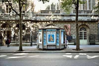
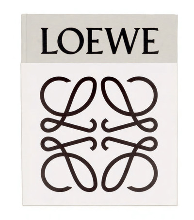
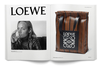
Michael: We came to the conclusion that, because this is one of the oldest luxury houses, if not the oldest, in the world and you have this burden of tradition to deal with, then rather than looking at it through the parameters of heritage and tradition, we should translate the idea of time into something cultural. We needed to excavate the heritage and find the moments that are relevant for us to address now. Loewe was originally a cooperative; it was never about a style; it was just a group of people working with leather as craftsmen. Then you have this German guy, Enrique Loewe Roessberg, who came in the 1870s, and gave his name to the cooperative. The first thing we saw when we visited the archives was a pile of brands – there was a new one every eight or nine years. It was very interesting to see the trajectory of the story like that. It justified our approaching it in a certain way. The previous logo was inspired by the brands used on cattle; it was designed by a Spanish painter in the 1970s. We came up with a much simpler version that returned to the source.
Jonathan: It was about removing all the layers.
Michael: We said that the logo had to go back to the idea of branding the cattle and the leather, and our idea was immediately validated by the possibilities generated by the logo.
Can we rewind a bit to when you went to Jonathan’s shows? What was it that struck you about what he was doing?
Michael: It was the language. It was obscure and coded, and full of contradiction. I really liked that there was this layer of ‘pseudo-ing’.
‘Rather than looking at it through the parameters of heritage and tradition, we decided to translate the idea of time into something cultural.’
That’s an interesting way of putting it.
Mathias: I thought it was really exciting that it was not only style, but also content. It was a new way of approaching fashion. Instead of replaying things that were already said, Jonathan had digested what had happened before and he was expressing it in the world of fashion. For me, this was new and fresh. Jonathan’s approach is global and cultural. He takes it for granted that fashion is culture, that fashion has an impact on art, and art has an impact on fashion, and that fashion has an impact on cinema. All these things are linked to one another. People at LVMH recognized that it could be good to inject this person into a brand such as Loewe, which had no image or point of view at the time.
I am curious about the book that Jonathan mentioned, the one he used to apply for the job?
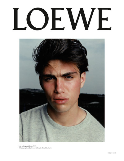
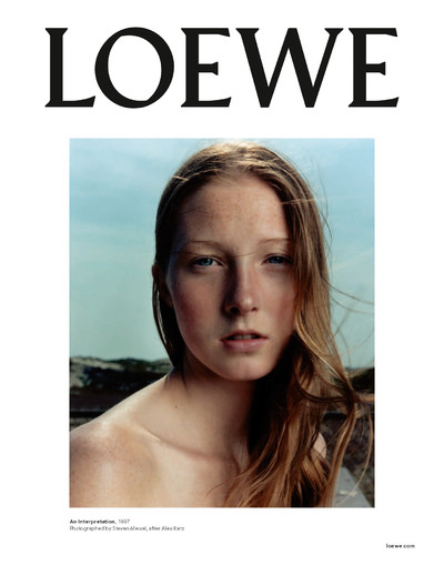
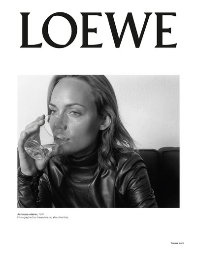
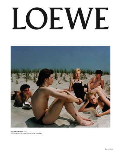
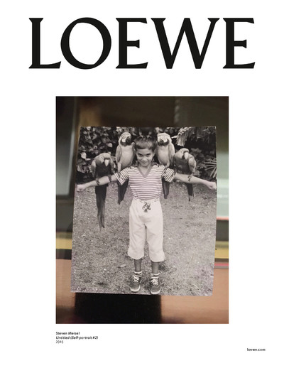
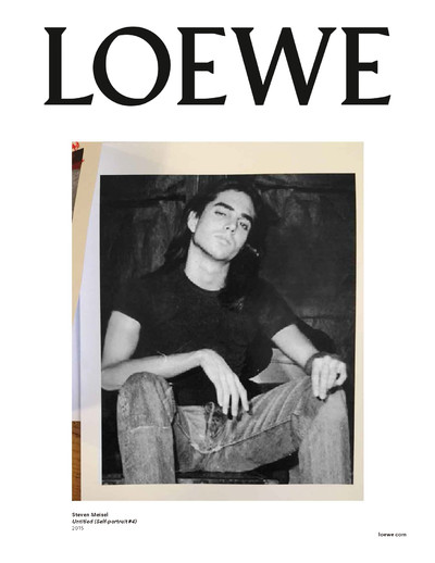
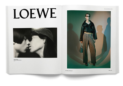
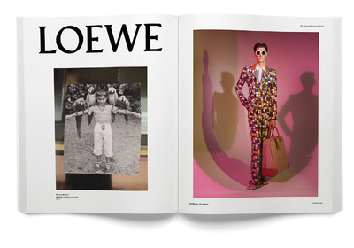
Michael: It was a book full of images, some taken from the Yohji catalogues, others from this 1997 story by Steven Meisel that was inspired by Alex Katz. For us that story was the reinvention.
And you used images from that story in the first advertising campaign. I was thinking that it must quite common to apply for a job with references from the past, but it is very unusual to be so honest about those references in public.
Michael: The fact that the story is a reference of a reference made it the cornerstone of this construction. It was the basis of our strategy to readdress and reconstruct Loewe.
Mathias: It was our common understanding that we could say, ‘OK, my reference is this image from Steven Meisel and I am not hiding my sources’.
Michael: Rather than trying to reinterpret the images, we said, ‘Let’s try to get permission from Steven and then use this for the beginning of the new chapter of this brand’.
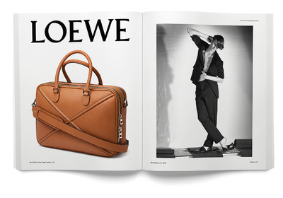
Mathias: So right away we set up this formula for the advertising where one image is from the past, a reference, one is from the present, which are the objects that are sold in the shops – the accessories and the bags – and one is the future, which is the fashion silhouette that foresees the show somehow. This was a revolution in terms of how to promote a fashion brand.
Jonathan: I’d never done a big brand before and I was living on adrenaline to get it done – I have lived on just adrenaline for the past two years. We did this thing, this drop zero, where I basically took a year out – no new products went into the stores for a year – because we were getting every single detail right. Every single aspect had to be changed, from the logo to the stores, everything. So during that process we came up with this concept where you would put the campaign on the street before the show, and then sell 25 percent of the collection from the show inside stores that day. We had to do that because we were running out of time. It wasn’t a strategic decision; it was because the stores were running out of products. But then it transpired that it is the best rhythm. There is an urgency in fashion now.
There’s this big debate about trying to change the rhythm of fashion now, isn’t there?
Mathias: Yes, but somehow we did it through intuition. We were pushed into coming up with a solution.
Jonathan: I think it was surreal for people to see the campaign on the street before the show even happened. When you reinvent a brand, no matter how big or small it is, everyone is desperate to know what it is going to be. So, if you launch with menswear as a presentation and you create a new advertising campaign with a still life of old logos and images by Steven Meisel that were shot in 1997, people find it very disorientating.
‘It was our common understanding that we could say, OK, my reference is this image from Steven Meisel and I am not hiding my sources.’
It strikes me as very radical to use old fashion pictures for a current campaign. It transgresses fashion’s guiding idea, that of newness.
Mathias: The idea is to eradicate the idea that fashion is only the future. Fashion can be a new image, or it can be an old image if it is framed in the right way. Jonathan works from that position.
Jonathan: In art it is fine to have references, but in fashion we have this preconceived idea that we have to own everything. I think, rather than owning something, it is important to work out what is right for the moment. Fashion is about trying to find out what silhouette, texture, bag, shoe, is right for now. It is all about how you mix it, how you articulate it. That is what fashion is now.
Michael: That is the position that attracted us to Jonathan’s work. There is an understanding of context, which for a graphic designer is part of the job.
That brings to mind the way Peter Saville always talks about his designs for Joy Division and the repositioning of neo-classicism in the late 1970s.
Mathias: The only difference is that Peter Saville was more of a post-modernist, erasing history by shifting something to another field. What is interesting here is that Jonathan is creating a surreal collage. It is engrained in the commercial realm and it is more incremental, and more realistic.
Michael: Somehow we created a channel in the context of advertising, the Loewe channel, where, instead of mixing everything in one image, there are several images that are talking to each other.
Can we have a type-geek moment? Tell me about the typeface that spells Loewe?
Michael: We chose Pegasus by Berthold Wolpe, because it was at the start of German modernism.
Which typeface was used before?
Michael: Bembo, the problem was it didn’t communicate anything: it didn’t feel English; it didn’t feel Spanish; it didn’t feel German. The word Loewe itself sounds weird in Spanish because it is German, and there are problems all around the world because people don’t know how to pronounce it. So we decided to ground the type in the German origin of the name, so at least we can restore its authority.
You redrew Pegasus a little?
Michael: Yes, Pegasus was only the starting point.
Did you make a whole alphabet of capitals?
Michael: There is an alphabet, but we restrict its use. Loewe is starting a craft prize and we are using it for the logo, but it can’t be used to say something like, ‘women’s bathroom’.
Going back to reworking the brand logo: why did it need to be redone?
Mathias: It was too fancy, too expressive, with too much feeling. The idea was to find something that simply brands an object without giving too much taste to it. It says where it comes from, but it doesn’t add any flavour. With the type and the logo, we wanted to create an identity that could encompass many different elements.
Jonathan: What really fascinates me is that you can put anything on a page below that word [Jonathan places his iPhone on a blank piece of Loewe headed paper] and you own it. When I first saw it, I was really struck by the O, which I think looks like an eye, an all-seeing eye – you hate me saying that, I know! I think you really need the O to help you pronounce the word. The O breaks it; it makes you stop. We did a whole collection covered in ‘Loewe’. There was this moment when we were like, ‘OK, I am now at one with it, now I feel that I am allowed to use it, that it can be everywhere’. I think that’s when people started to understand where we were going.
Do you see it as yours?
Jonathan: To be very political, and what I really feel is successful about it, is that it is a very good platform for whatever this brand does after me. I think ultimately I’ll feel that we have done a good job if someone else is able to step in and the brand can still continue with this logo. That is going to be the test.
Mathias: We made a print that is a compilation of all the existing marks for Loewe – a pattern made from old logos. It was another way to embrace the past without fear. It says, ‘There is a new logo and maybe one day this new logo will also be part of this collection’. Instead of just saying this is mine, I want this brand to look like we are creating a space. Somehow, in that, you can hear many voices pronouncing the word.
‘You can’t just be a fashion designer; you have to do everything. Thinking you can just turn up and do the clothing simply isn’t possible anymore.’
But do they all say it a different way? Do you think that more people can pronounce Loewe now?
Mathias: We are working on this.
How is that going to happen?
Mathias: We can’t tell you.
Might it be the world’s most mispronounced brand?
Jonathan: Sometimes it can get incredibly frustrating, but that’s the challenge. It is part of it.
Mathias: That is why the visual language is as important as the logo itself. I don’t want to say that we invented the white background, but somehow we have used it to be more like a sign. And even the silhouette can look like a sign, and the images from the past are also becoming more symbolic. We were trying to implement a structure, a system, that is invisible. It has more to do with architecture than decoration; it is like an architect working in a city.
Michael: A bit like urban planning. After we had all these conversations about modernism and the German influence, which all came from intuition, Jonathan started looking into the archive and found this moment of really hard-core modernism in Loewe created by this Spanish architect. All of a sudden we had something that we could use.
What was this ‘moment’?
Jonathan: It was when Javier Carvajal was technically doing my job, in that he oversaw every aspect of the brand. I found these plans for a building he had done; it was a very Brutalist, something you would never have expected from Loewe, and it had been completely forgotten. It was as if all this had never existed.
When was this?
Jonathan: In the 1950s and 1960s.
Does the building still stand?
Jonathan: No, not any more, but we have pictures, and they informed what we did with the store in Japan. It was interesting. Rebranding can create a lot of friction – I had to convince an entire company to change its whole language – but when we started showing the images of Carvajal’s work to people at Loewe, they understood what we were doing.
Do you work with architects on the stores?
Jonathan: I work very closely with the architectural team at Loewe. There is one woman, Paola, who does everything with me. You work with architects when the right project comes up, but at the moment it’s not needed.
Are you refurbishing all the shops?
Jonathan: Yes.
Dramatically?
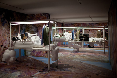
Jonathan: Yes. This might sound a bit precious, but when you inherit a brand that has so many stores internationally, you start to realize that stores are actually public places. So for me there has to be something particular about the space in each location. It’s about building a cultural brand today. The one in Miami is interesting because it’s as if we took an 18th-century building, dismantled it, and then rebuilt it inside a white box in Miami. Which we kind of did! It’s as if M/M has created a platform and I can do whatever I want with it: what we did in Miami is like something from the past, but it is now in the present, and then it becomes part of the future because you can do exhibitions in it. It all can be recontextualized. We used it for an exhibition about Paul Nash and Lucie Rie.
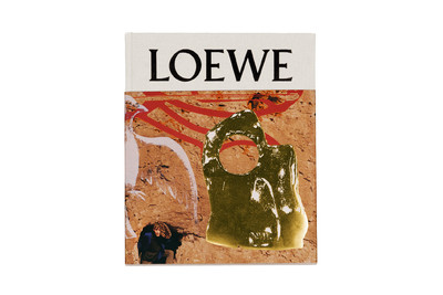
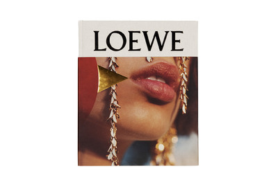
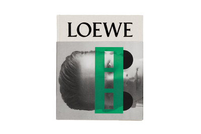
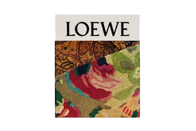
Can we talk about the books? Which was the first?
Michael: It was for the first collection, menswear.
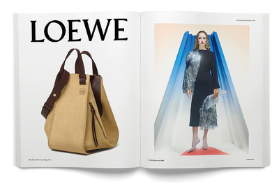
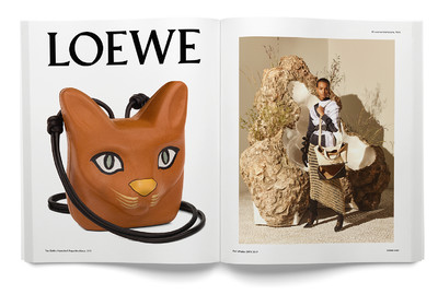
The one with the new brand on the cover?
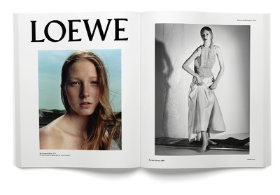
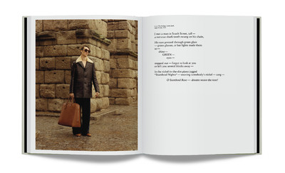
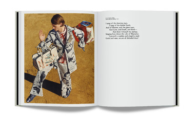
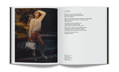
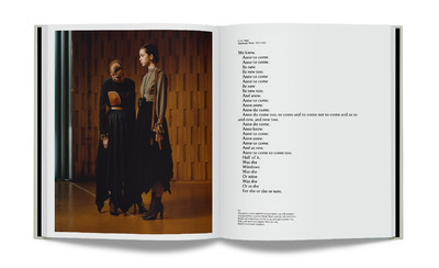
Mathias: Yes, every season there is one book for the men and one for the women, each with a photographic essay by Jamie Hawkesworth. The point of them is that they are content driven. There is always a poem and the photographer Jamie is what I would call a true photographer. He started out as a documentary photographer, and I would say that he has a true photographer’s language. So the books have a narrative, which gives them a longer lifespan than just one season.
Jonathan: The latest women’s book was shot the day before the show at the UNESCO building in Paris.
So the photography was done very fast.
Jonathan: Oh yes, mega quickly.
But the form of the books, with the cloth covers, seems to imply a slower pace.
Mathias: Yes, producing them is very quick, quite spontaneous, but the way they are treated as objects is very long term. They are signed and numbered.
‘Fashion needs content and I think brands will have to increase the amount they put out tenfold in order to keep the dialogue going.’
How do the men’s and women’s books differ?
Michael: The book for the men is developed around the presentation. There is no show, so this book acts as a lookbook. We use locations in Spain; we travel around to discover places and get inspired. There is something more scripted in the menswear and the poetry is connected to that. But for the women, we shoot the day before the show at the UNESCO building, because Loewe is committed to sponsoring its refurbishment.
Jonathan: At the moment they’re restoring these Miró murals. So we are exploring a different aspect of the building every season.
Tell me about the poetry. Who finds it?
Michael: I do.
Where do you look?
Michael: Everywhere. I have a good method now. It is a secret!
I was struck by the descriptions of the clothes in the books.
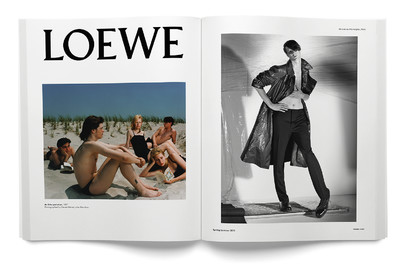
Michael: This is something that we implemented at the beginning. We said that the brand should have a voice, so we commissioned a writer for all words that are printed around the campaign, which is something quite new for fashion. Rather than just being used as decoration, every word makes sense. And everything has a caption: the pictures on the white backgrounds have a caption, the silhouettes have a caption, the Meisel pictures have a caption.
These captions seem very meticulous and technical, but they also have
flourish.
Michael: They are technically correct, but there is space for a certain amount of licence. They are like something you would find in a museum. Everything is presented to the public. That is what I was talking about when I said we have built a channel; it is really like a Loewe channel.
How are the books distributed?
Jonathan: For someone like me, when I was a fan of M/M, what was really important to me was the printed matter. There is nothing better if you want to engage with fashion and you have no money than being able to get some printed matter like this from the brand. If nothing else, you can get a book. This is incredibly important. It’s a way of reaching a different demographic. For me, it has to have the same impact as a bag. You know, it has the same gravitas. It will be interesting to see how brands use content in the next few years. Fashion needs content and I think brands will have to increase the amount they put out tenfold in order to keep the dialogue going.
What do you mean by content?
Jonathan: Well, the book is one thing, but you then take a picture of the book and it becomes a different piece of content. Then you open up the poster that is the cover of the book and you put that on the wall and you have more content. In a way, printed material becomes much more than itself.
Do you see yourself as more of a content creator than a designer at Loewe?
Jonathan: You know, what you realize when you start a rebrand is that you can’t just be a designer, you have to do everything. Thinking you can just turn up and do the clothing simply isn’t possible anymore.
And you welcome that?
Jonathan: I do. It’s more tangible; it’s more about curating.
Has it made you rethink your own brand?
Jonathan: Yes, I think so.
Mathias: With his own brand, it is more like he is expressing himself. Here it is as if he were an artist in charge of a museum.
Jonathan: It is a big detachment.
Michael: But at the same time he feels that he is responsible.
Jonathan: I take everything very personally while I am here. If there are not enough bags in store, then that will become my problem. If the till is not working, if there is a problem with the front door, that becomes my problem. That’s when I am here, but my week is very compartmentalized, because otherwise I would go crazy.
Let’s talk about the advertising.
Jonathan: We’re not the biggest advertiser in the world.
Mathias: We adjust to the media that we have. It is very functional. We’ve created a channel where we can combine the three elements – the past, the present and the future – instead of having them in the same image. In most fashion imagery or advertising they combine those elements – the reference, the product and the prediction – but we’ve separated them.
Michael: So we have a mood, a girl, and a bag or shoes. It is completely broken down.
‘Ultimately, I’ll feel that we have done a good job if someone else is able to step in and the brand can still continue with this logo.’
Do you design the sets behind the models?
Mathias: Yes, since the first one. It is an evolving background. We try to morph according to the mood of the collection.
Do the backgrounds for the ads bear a relation to the images in the books?
Mathias: We think about it at the same time, and we have already done the advertising for the show that is going to happen next week.
Jonathan: Which involves a commitment that is quite unusual.
Mathias: Jonathan has already been working on this collection for a year and now he is working on the next one, so, in creating the ads before the show happens, we are just telling the truth. It makes more sense now, when you go to a show and there are images from it right away everywhere in the world, and then in the following month companies like Zara are producing clothes like the ones they saw.
Jonathan: It seems be making things faster, but actually it is very relaxed for us. I do two brands now and I am more relaxed than when I was doing one because everything is very organized.
Mathias: We really connect with this approach because the franticness of trying to do something at the last minute is never something that we really enjoyed. We like things that are planned. Of course there are still chance events and surprises, but I still think it is better to construct a space within which you can express yourself, rather than relying on self-expression for everything.
Jonathan: I get bored if it becomes too exhausting. There’s nothing worse. You start to feel like you’re saving people’s lives, but you’re not – there’s no urgency.
So do you know what your ‘past’ references will be in six months’ time?
Jonathan: Yeah, we do.
So what will be the past in the future?
Jonathan: The image that we are putting out this week: it’s a nude.
Michael: It is about readdressing male romanticism.
Jonathan: This season is about becoming bored with people wanting to be young. Everyone is obsessed by being young, which is impossible for them to be.
How long have you all been working at Loewe?
Jonathan: Only two and a half years. It all started from one book and now all this! [Jonathan builds a pile of Loewe publications on the floor, which he Instagrams on his personal account.] I am always being asked, ‘The industry is getting so fast, how can you do so much work?’ and so on. Yes, it is fast and that’s kind of great. Just get on with it. It’s exciting. If you get the foundations right you can do what you want without overthinking things. Of course, I am very lucky to have people around me. It works because I am collaborating with people. I am not going to pretend that I don’t work with other people. I don’t think that is how high-fashion houses function anymore. You need all these people or it is impossible.
Have you three ever had a fight?
Jonathan: No.
Mathias: No, no, I think we are too old for this.
Jonathan: I trust them. I like being told what to do sometimes. There are so many aspects; I have to be able to trust other people.
Michael: But in a way it goes back to the idea of the platform that we created. It is not a platform for ego. There is always room for conversation.
Jonathan: I think if you are going to build a multinational brand, a big brand, it is the only way it can work. I have not come into this brand to make it a €100-million business. It has to be bigger than that. I am very open about this. I want it to be a commercial success. And I feel like this platform allows that because it has the energy of not one, but many. That is where luxury has to go in the end. Yes, there is one individual whose head is on the block, but everyone has to be accountable to create energy in the brand. That creates static, which is good.