When art director Ruth Ansel took Harper’s Bazaar into the unknown.
By Jonathan Wingfield
Curated by Dennis Freedman
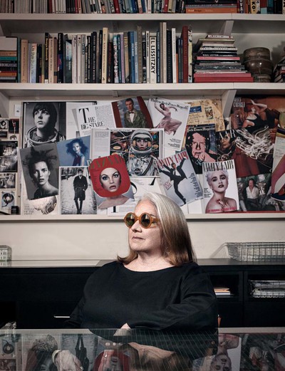
Portrait by Gregory Harris
When art director Ruth Ansel took Harper’s Bazaar into the unknown.
Ruth Ansel’s illustrious career in art direction is a story of talent and timing. Back in the 1960s, when Ruth was just 24, she and Bea Feitler became co-art directors of Harper’s Bazaar, working alongside formidable fashion director Diana Vreeland and star photographer Richard Avedon. As we now know, it was the perfect moment to challenge and reinvent what a glossy fashion magazine could be, by exploring and presenting the myriad changes that were being played out in society and culture. Later, in 1974 – the year of the Watergate scandal – Ruth became art director of The New York Times Magazine, at a time when the power and influence of the American newspaper giants had never been greater. Then in the golden age of opulence that was the 1980s, Ruth went on to art direct that era’s bible for successful living, Vanity Fair. And each time, she was the first woman in that position.
It was Dennis Freedman – long-time creative director of W magazine, and creative director of Barneys since 2011 – who suggested we feature Ruth Ansel in the pages of System. Having first met Ansel when he was a 20-something, aspiring magazine designer looking to find his way, Freedman says it was her presence, guidance and pioneering body of work that inspired him then, as with now, in his own stellar career. ‘The first time I met Ruth was in her office in the Condé Nast building, where she was redesigining House & Garden.
I was shown her mock-up of the newly designed magazine, and she asked me what I thought of it. I have no idea what I said. I just remember walking back out onto the street elated. With that simple gesture, Ruth had made me believe that my opinion counted.’
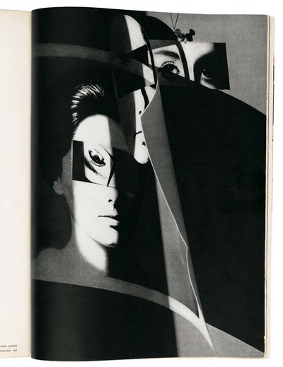
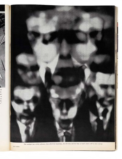
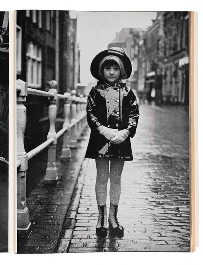
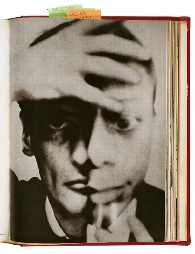
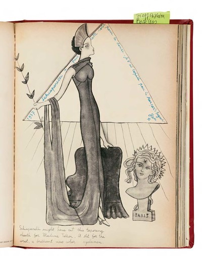
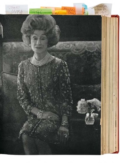
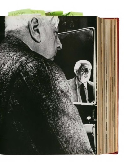
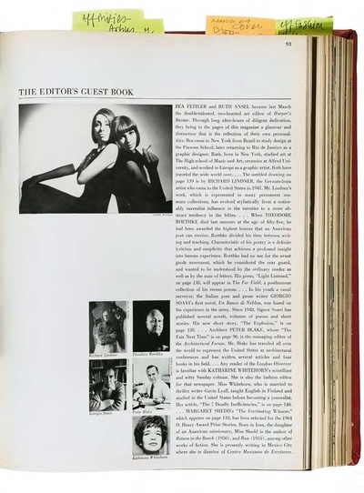
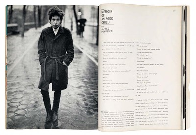
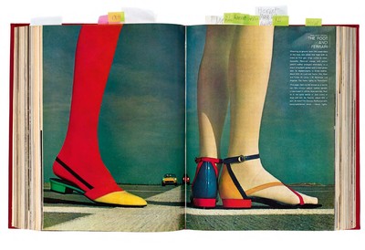
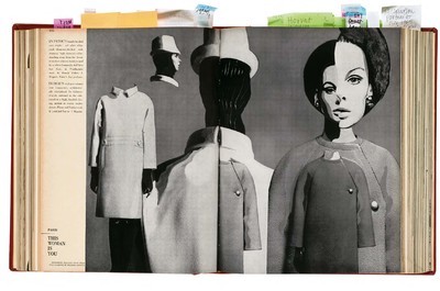
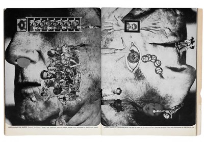
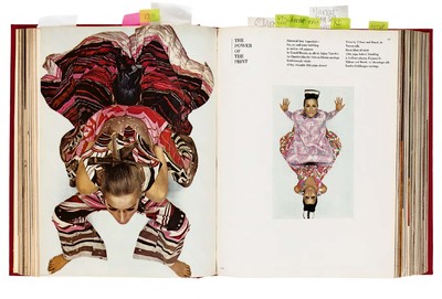
In the portfolio of Ruth Ansel’s work that Freedman has curated for these pages – selected from Ansel’s personal leather-bound archive volumes, complete with Post-its and annotations, which she keeps in her apartment on New York’s Upper West Side – he chose to home in on Ansel’s lesser-seen work from the Harper’s Bazaar years. Beyond the era-defining covers she created with Avedon, Ansel collaborated closely with everyone from Guy Bourdin and Jeanloup Sieff to Andy Warhol and James Rosenquist, to Bill Brandt and Diane Arbus, Saul Leiter to Hiro. In doing so, she redefined what photography, illustration, artwork, text and blank space could perform on the page. Hers was a giddy and seductive world that seemed to take the notion of modernity, up its sticks, and plant it somewhere in the near future. Only to repeat the process 30 days later.
Looking at the work now, and listening to Ruth describe the times in which it was assembled, one is struck by the sheer sense of fearlessness and adventure she and her co-conspirators felt. In the same way that the 1960s saw humankind’s tentative first steps in outer space, so Ruth Ansel’s work was reaching beyond the accepted norms, in search of new truths. Much of what we see here has since been copied, emulated, updated. But how often is it surpassed?
‘At Nina’s house, de Kooning was painting his Woman series in their downstairs front room and Jackson Pollock would stop by for late-night dinner.’
Jonathan Wingfield: In what ways did your childhood prep you for life in magazine publishing?
Ruth Ansel: When I was a kid growing up in the Bronx there wasn’t much to do in my neighbourhood except dream of getting out. I was introverted, enjoyed playing the piano, drawing and ice skating, not necessarily in that order. I had a much older brother and sister – we were 10 years apart – so I often felt I was growing up like an only child. From an early age I created imaginary playmates, and was drawn to performing; I’d read aloud in the confines of our tiny bathroom and practice losing my Bronx accent.
Were you exposed to much art or visual material at home?
Growing up in the 1940s and 1950s, I was a child of the movies, and the dark theatre was a refuge, a dream space, a source of inspiration and a way to escape into other people’s fantasies.
Tell me some of your favourite films from your childhood.
Those directed by Michael Powell: The Thief of Baghdad and then The Red Shoes. I also loved The Wizard of Oz, Singin’ in the Rain, George Stevens’ A Place in the Sun, with Elizabeth Taylor and Montgomery Clift, who was my ‘movie love’! I saw the images on screen as single frames, moments in time, and considered them compelling narratives with an emotional impact – stories of beauty, of grace, of places to see, style and, later, of sexual freedom. Without my knowing it, those days spent watching movies had a lot to do with informing my later choices as a designer. Magazines like Harper’s Bazaar were the closest thing to movies I could find, in that they were about telling stories through seductive imagery.
At what point did your visual world progress from the movies to art and graphic design?
I attended the High School of Music and Art in Manhattan, which was a very advanced high school for creative kids. One of my classmates was Nina Castelli, whose parents were Leo Castelli and Ileana Sonnabend, the most formidable forces in the art world in America. Our friendship was a turning point in my life, because thanks to Nina’s family I spent a summer as their guest in East Hampton when I was 15 years old. I’d never even been to anybody’s house who had real paintings on the wall before, but at Nina’s place Bill de Kooning was painting his Woman series in their downstairs front room, and Jackson Pollock would often stop by for late-night dinner with Larry Rivers and Michael Sonnabend. I mean, it was quite amazing. Thanks to the Castellis I also saw my first Balanchine ballet, my first Rauschenberg and Johns paintings, and my first Marisol6 sculptures. Unsurprisingly, it was around that time that my love for art took root; the real rock stars in my life were Picasso and Matisse.
Were you interested in pursuing fine art as a career yourself?
I was a ceramic design major at Alfred University in upper New York State, but I wasn’t a serious student. The idea of working hard to be an artist didn’t make sense to me. I had this misconception that if you were really talented you wouldn’t have to work hard, it would just come to you. I knew the odds of my being as successful as those giants I’d been exposed to with Nina, were minimal. So when it was time to leave university, I was like, ‘How can I earn a living with this knowledge of art?’ Somebody mentioned graphic art to me, even though I cared nothing about photography and less about fashion – apart from an obsession with Capezio shoes – and I didn’t really know what a graphic designer did. But the opportunity beyond my wildest dreams presented itself when I became an assistant designer in the Harper’s Bazaar art department, under Marvin Israel.
How did you meet Marvin Israel?
I cold-called Harper’s Bazaar about working in their art department because I’d always loved the magazine. I asked if the art director Henry Wolf8 was there, and the person who answered said, ‘No, Mr. Wolf’s left the company, and he’s been replaced by Marvin Israel’. Meeting Marvin was the greatest stroke of luck in my life. Although I didn’t have a graphic-design portfolio he decided to take a risk and hire me as an assistant anyway. He liked the idea that I didn’t have to ‘unlearn’ graphic-design clichés. Bea Feitler – his protégé and star pupil from Parsons – had been hired a month earlier, so the whole Bazaar art department was just the three of us.
‘By the time I joined Harper’s Bazaar in 1961, it was evident that the whole social value system had begun to dissolve and would require a new vision.’
What did Harper’s Bazaar represent culturally at the time?
Historically speaking, Harper’s Bazaar had claimed a certain cultural position, mostly because the intention of the magazine in its early days was to idealize everything. A fashion photographer was not to show what the local trends on the street were; he was to idealize the woman, whatever she wore, and however she lived. The idealized woman was remote and removed. By the time I joined the magazine in 1961, it was evident that the whole social value system had begun to dissolve and would require a new vision.
How was it, entering into the life of Bazaar at such a young age?
My first few months were a disaster. My layouts were terrible and I was convinced I was going to get fired. But Marvin refused to let me quit and often drove me crazy, insisting that I stay many nights and get it done. His standards for design excellence were non-negotiable – he’d been a student of
Brodovitch – and it was the beginning of an important relationship that shaped my deep respect for both photography and for Marvin. Despite the devastating criticism he’d often dish out, I’m still learning what he taught me to this day.
So you were really learning on the job.
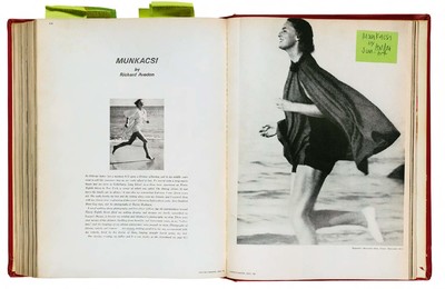
Well, I wasn’t even smart enough to say to myself, ‘You better find out about the history of graphic design and of magazines’. It was Marvin who said, ‘You gotta go to the library and look at those bound issues of Bazaar from the 1930s and 1940s’. Thankfully I did, because I discovered the brilliant work of people like Martin Munkácsi, Cartier-Bresson, Bill Brandt, Cocteau and Man Ray. I grew to understand that the special qualities these photographers and artists possessed came from embracing their respective individual passions. Their intentions were to reveal and expose a hidden aspect of character through portraiture – conceptualized character could be anything of their making. In the context of the magazine, it became a more idealized woman. Suddenly, it struck me that my love for art and artists could be relevant in the setting of a fashion magazine.
Which particular images or photographers left their mark on you?
Munkácsi, more than any other photographer, revolutionized the way women looked in Bazaar. He freed them up to run and jump and express their emotions through movement. As Dick Avedon, who credited Munkácsi with having influenced his work, said, ‘He brought a taste for happiness and honesty and a love of women to what was, before him, a joyless, loveless, lying art. Today the world of what is called fashion is peopled with Munkácsi’s babies, his heirs … the art of Munkácsi lay in what he wanted life to be, and he wanted it to be splendid, and it was.’ I remember one day though, a dishevelled old man in a wrinkled raincoat came into the Bazaar office; he was a mess – all bent over and not very attractive – and I just thought, ‘Eurgh!’ It was Munkácsi who’d come to see Marvin about an assignment, because he needed money. He died penniless in 1963, and that was a really big lesson for me: I never got the chance to meet Munkácsi because I’d been so smug and judgemental.
Marvin Israel comes across as a rather formidable character.
Well, he had a monstrously unstable personality. He could scream at people he didn’t like. He used to throw editors out of his office. They’d be there to talk about a layout and he’d just shout, ‘Get the fuck out of here!’ When Marvin and Dick became this duo, they were like bad little children making mischief against anybody.
What was his relationship to art and photography?
Marvin was an accomplished painter whose sensibility about the contemporary visual world was extensive. He understood how to create that world as the times were changing and how to bring it into a more modern context. He’d commission Robert Frank and Diane Arbus and place their portfolios right opposite the extremely fancy uptown-fashion pages, and that is what made it glorious. Marvin was Arbus’ mentor and brought Diane into the magazine. The first portfolio I ever worked on was Diane Arbus’ The Full Circle – it was her pictures of all these very weird downtown New Yorkers.
‘Nancy thought Avedon’s cover image was a man in drag, so she wanted to kill it. Marvin went ballistic and told Nancy to go fuck herself, and she fired him.’
How did you go from being Marvin Israel’s assistant to becoming Bazaar’s co-art director with Bea Feitler.
One day in 1963 Marvin had a huge fight with the magazine’s editor in chief Nancy White over a Dick Avedon cover. Diana Vreeland was the fashion editor of Bazaar at the time, and I think that Dick was very angry that the job had gone to Nancy – who was a white-gloved Catholic lady and the niece of [one-time Bazaar editor in chief] Carmel Snow, instead of Vreeland. Because Marvin and Dick were naughty boys, they shot this cover with a model called Danielle Weil, who looked suspiciously like Diana Vreeland – nothing like your typical pretty and glamorous model. To make matters worse, Nancy thought it was a man in drag, so she wanted to kill the cover. Marvin went ballistic and told Nancy to go fuck herself and she fired him. Suddenly Bea and I found ourselves the art directors. It was a strategic move by the powers that be, who were biding time until they could find a suitable – male – replacement. I would’ve liked to know what was said and by whom to eventually convince Nancy White and Diana Vreeland to wait and see how we got on instead of firing us. My guess is it had to be Dick [Avedon]. He was a powerful influence at the magazine, and everyone listened to him. Don’t forget, this was a photographer who had already had much financial success as well as name recognition – the Hollywood movie Funny Face was about Avedon, with Fred Astaire as the photographer ‘Dick Avery’ – so I think his radical suggestion intrigued everyone. Looking back, I give the Bazaar folks lots of credit for taking a chance on two untested young girls. It was never once discussed with Dick, and I regret that I never properly thanked him then or later on.
What were your impressions of Avedon when you began working with him?
Dick was pivotal in my life, from the moment I stepped off the elevator in the old Bazaar building to the moment he died in 2004. He had a boyish slender build, a handsome face, infectious laugh, and endless energy. Ultimately, he viewed his profession as a calling. Dick was much more than a photographer at the time; he was a revolutionary with a camera, because his intention was to do what had never been seen before. He loved the whole process of picture making: it started with thinking of the image he wanted to create, taking the pictures, printing them in his own studio, making ravishing prints that every other photographer envied, going to the presses, finding out about special inks, making magazine layouts, working on books, creating exhibitions, and teaching a workshop of young photographers as a continuation of Brodovitch’s legacy.
What about Diana Vreeland?
The thing I really loved about Mrs. Vreeland was that she could be reverential towards the likes of Dior and Givenchy and Madame Grès – to her, they were as great as any sculptor or painter – but also immediately recognize Courrèges, this futuristic designer who broke the Paris fashion-world traditions. She adored the young; she got energy from them and never saw them as separate to her world. I mean, she was singularly responsible for putting women all over America in go-go boots and micro minis. Marvin told me this story about how he was talking to Mrs. Vreeland and she looked out of the window, and pointed down to Fifth Avenue, and she said, ‘Marvin, you see those women in those boots, I made them!’
Do you think you and Bea Feitler appealed to Diana Vreeland because you were so young and ‘new’?
Yes, I think so. I remember once I was stuck for an idea with what to do with some pictures of this big bag, which was supposed to be worn over the shoulder. I went back into our art department cubby-hole and started to blow up a picture of the bag over a full double spread, and then took it to Mrs. Vreeland. She went crazy with happiness, because something that was unexpected, that changed the scale and that changed the status quo, made her very excited.
What did you learn from working with these older figures at Bazaar?
Vreeland, Avedon and Israel – the holy trinity! No matter how talented they were – and they were enormously talented, obviously – they worked harder than anybody. That was a revelation to me, as I was a pretty lazy kid. Secondly, they showed me how to stand up to conservative forces within the magazine by trying to do something new that would challenge the status quo.
‘Avedon, Bea and I attempted to conceptualize something entirely new: to change the nature and structure of what a fashion magazine could be.’
Can you give me an example.
Sometimes I knew I had to risk taking a chance on an unexpected talent. Lee Friedlander wasn’t an obvious choice of photographer at the time, especially when it came to commissioning him to take photographs of the new shiny sexy American cars of the 1960s. Cars were icons of glamour and fashion, and I wanted to give Lee complete freedom to do whatever he felt like doing. And he did. He shot them on the streets of small towns, near burger joints, gas stations, along main street. When he sent in the photos, I loved them and made dummy layouts. The editors weren’t pleased though; Lee was paid for his work and the photos were returned unpublished, in the same yellow box he sent them in. The best part of the story is time proved my instincts right: The New Cars 1964 was published, and Lee’s pictures finally got the recognition they deserved.
How often did those kind of risky commissions actually get published?
One example that springs to mind came later in my magazine career, when I was art director of House & Garden magazine. Someone came up with the idea of featuring Graceland, Elvis Presley’s home in Tennessee, and I persuaded William Eggleston to photograph it. I didn’t know him at all, but I thought it was worth a try, so I picked up the phone. At first he hated the idea; he thought it was beneath him and refused, but many phone conversations later he agreed and those pictures became some of the most celebrated colour images he ever produced.
Just to go back to Bazaar in the 1960s. Can you give me a snapshot of what it was like in New York at the time, and how that influenced your work at the magazine?
We were young and fearless. We thought we could go anywhere and do anything for fun, and did. New York was a free-spirited place if you were curious and energetic; the atmosphere was electric, and cocaine and speed were the drugs of choice, even though a lot of people like Edie Sedgwick would later have their lives destroyed by the excesses of the time. The art scene was centred in New York, and artists ruled. I’d go to my friends’ art openings and happenings on Thursday nights, and I’d often hang out at Max’s Kansas City where the Velvet Underground and Nico would perform. The place was filled with experimental sounds, and untrained voices, singing, reading concrete poetry. John Chamberlain, Larry Rivers and Jim Rosenquist held court together with Andy [Warhol] and his art posse. Uptown art groupies led by ‘Baby Jane’ Holzer became downtown hippy camp followers. Everything that was happening felt new and accessible and we were a part of it. It was the source of many of the ideas I brought back to the magazine.
I guess that whole scene informed your work on the celebrated April 1965 Avedon ‘Pop’ issue of Bazaar.
That year was kind of the crowning glory of everything for Dick and for us, in the sense that things were changing in the world. There was rock’n’roll, there was the pill, sexual freedom was the latest thing, and youth had taken over. Everything that we were doing, every kind of art and every kind of writing, it was all about young people. And on top of all that, it was the time of space exploration. Dick understood all that context, as only he could, so he said to Bazaar, ‘I want to do an entire issue,
I want to be the editor and the sole photographer’, and he was.
How did you put the issue together?
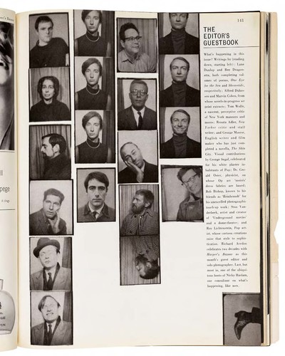
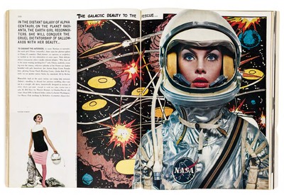
More than any other, that issue showed my ability to capture change as it was happening. Dick Avedon, Bea and I attempted for the last time in the history of American fashion magazines to conceptualize a new magazine; to change the nature and the structure of what a fashion magazine could be. Until then it was a question of, ‘This section is for fashion, and this section is for features’. We wanted it all integrated, in strange ways, and to change the nature of how you took in the information. It was daring for its time, a fashion magazine that combined the power of a massive youth movement, pop culture, space exploration and new literary voices. The Beatles, Bob Dylan, Jasper Johns and Bob Rauschenberg were photographed on the streets and in the studios of New York. At that time people who were walking the streets were dressed so much in advance of the things shown in fashion magazines. Dick went to London to photograph leading Mods who were changing the face of fashion. Outrageous fantasy concepts turned up throughout the issue. We used new Day-Glo inks on our presses, and even a shiny silver ink to depict hair flying around to the beat of disco music. I called up many of my art-world friends like Warhol – who photographed the issue’s contributors in a Photomat – Lichtenstein, George Segal and Claes Oldenburg. Stan Vanderbeek, the underground filmmaker, created an original double-spread montage collage. Renata Adler and Tom Wolfe were contributing writers. We got permission from NASA to put model Jean Shrimpton in an astronaut space suit, and called it ‘the first woman in space’.
That image in particular feels like a perfect snapshot of the time – the convergence of fashion, Avedon, Jean Shrimpton, pop art, and space travel.
It was called ‘Galactic Beauty’ and it opened the issue’s main portfolio. The final collage came about because Dick wasn’t satisfied with the results of shooting Shrimpton in the space suit against no-seam paper in the studio. He felt it looked boring – especially for the issue’s opening spread – and he was right. He turned to me and put me on the spot: ‘Please come up with something.’ I didn’t know what to do, but because I was such a pop-art fan, and knew Roy Lichtenstein and Andy as friends, I had an unconscious flash. I ran out of the building, went to every nearby store that sold comic books, bought up as many as I could find, and ran back to the Bazaar art department. And there it was. That single magnificent outer-space panel jumped out at me and I quickly had it blown up. Everything fitted and worked perfectly: the scale, the colour, the black sky with the white stars, the drawing of the spaceships, the movement of the comic-book rings, all came together behind Shrimpton’s beautiful face. I showed the collage to Dick and he immediately jumped for joy and said, ‘You did it, this is perfect, let’s do it’. No hesitation. The final collage was made and off it went to the printer. The only thing I now regret these many years later is that I never kept the original comic book, nor did we properly credit the wonderful artist who drew that panel. That artist saved me. So thank you, whoever you are.
How was the issue received?
It was a total failure in terms of the suits; they really hated it. We dared to photograph the first young black model – Donyale Luna – wearing an expensive Galanos couture gown. No high-fashion magazine in America had ever run a photo of a black model in expensive fashion up until then. They had only run black models in less expensive clothes – that was code for ‘acceptable’ – but not in couture. In other words, this was an insidious form of segregation, which all fashion magazines practised. We wanted to break with that shameful tradition. The reaction of the publisher William Randolph Hearst, Jr. was completely negative. This devastated us. Mrs. Vreeland left. Shortly after, Dick followed her to Vogue and several years later, Bea left for Ms. magazine, and then I later left for The New York Times Magazine.
It was too daring for the time.
To put it in perspective, 1965 was a watershed year for civil rights. Martin Luther King marched over the bridge to Selma, Alabama, and Lyndon Johnson signed the Voting Rights Act of 1965. Nevertheless, the issue was a financial disaster and many readers criticized it. Hearst had begun to be concerned with the economics of the market and was not interested in daring and inventive concepts. But the cover won the highest award in the New York Art Directors Show, and has been reproduced in graphic annuals throughout the world.
You’d mentioned earlier that Marvin Israel was extremely demanding. How would you describe your own style of working, dealing with photographers?
I do what I do pretty intuitively. I know at times I’m demanding, impatient and never satisfied. I often let that show when working with colleagues and photographers. I’m not a screamer like some, but I used to get very moody and intense and shut down. Now because time is so precious I’ve dropped the ‘moody’ and kept the ‘intense’ part. But it’s all about caring so much you want to get it right, so you’re willing to fight for it. If your work has any value it will outlive any of those gossipy tales of bad behaviour – so always reach for something beyond your grasp, show respect, and recognize it’s not all about ‘you’.
What in your opinion, does a good art director do?
An art director at best is a catalyst for change responding to evolution in all areas of culture. I like to challenge everyone’s comfort zone, especially my own. I think predictability in magazines has become the rule and I’m completely for the opposite. I like readers to be provoked, disturbed, even outraged. Often it’s the defects that are worth celebrating. It’s never about perfection. Finding out what doesn’t work isn’t failure – it’s a way of eventually finding out what does work. Finally, what I really like most about art directing magazines is that they are always a work in progress. Another issue is over and it’s on to the next and the next … you just keep going.
